
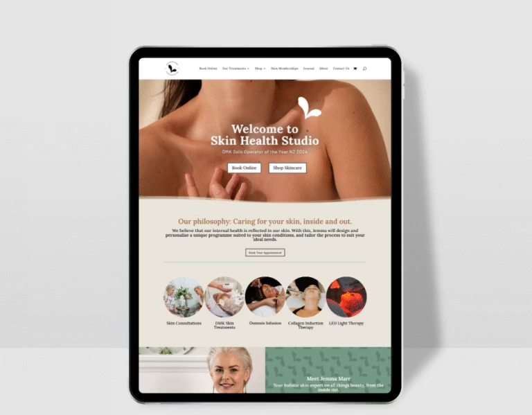
A new client does not walk into your clinic with a completely blank opinion.
By the time they arrive, they have probably looked at your website, checked your Instagram, read your treatment menu, opened your booking system, compared a few options and wondered whether they’re choosing the right thing.
The clinic experience has already started.
This is something I think beauty and skin clinics can easily underestimate. In person, the clinic might feel calm, professional, warm and considered. The treatment room might be beautiful. The client care might be excellent.
But if the website feels confusing, thin, outdated or hard to move through, there is a gap between the experience you give in clinic and the experience people get before they book.
A good beauty clinic website should help people feel like they are already in capable hands. It should make the next step feel clear, the treatment pathway feel considered and the business feel as trustworthy online as it does in person.
The short version
Your clinic website is part of the client experience. It shapes how people feel about your clinic before they book, arrive or speak to you.
For beauty clinics, skin clinics and cosmetic clinics, that means the website needs to do more than list treatments. It should reflect the feel of the clinic, answer the questions new clients are already thinking about, and make booking feel calm and straightforward.
My view is that a website should feel like a natural extension of the clinic, not a separate thing sitting online that clients have to figure out by themselves.
The website should feel like the clinic they will walk into
When I’m looking at a clinic website, one of the first things I think about is whether the online experience matches the real one.
Does the website feel warm if the clinic is warm?
Does it feel considered if the treatments are considered?
Does it feel clear if the consultation process is clear in person?
Sometimes the answer is yes. Other times, the website is underselling the clinic completely.
I see this when a clinic has grown up, refined its treatments, improved its space, invested in better products or built a more experienced team, but the website still feels like the earlier version of the business.
That can create hesitation for new clients. They may not realise how professional the clinic is because the website has not caught up yet.
New clients are looking for reassurance
People are careful about booking beauty, skin and cosmetic treatments.
They might be excited, but they may also feel unsure. They may worry about choosing the wrong treatment, spending money on something that does not suit them, feeling judged, or arriving and not knowing what to expect.
Your website can soften a lot of that before they book.
My recommendation is to treat the website like the first layer of client care. It can explain where to start, who each treatment is for, what happens during a consultation, how the booking process works and what the client can expect next.
This is especially important for skin clinics where the pathway is more personalised. If a client needs to start with a skin consultation, the website should make that feel helpful, not like a barrier.
The skin consultation page your clinic probably needs goes deeper into that first-step experience if consultations are central to the way your clinic works.
Your homepage sets the tone quickly
Your homepage does not need to explain every single thing.
It does need to help people understand where they are, what kind of clinic you are and what they should do next.
I usually want the first part of a clinic homepage to answer a few simple things quickly:
- what kind of clinic this is
- where the clinic is based
- who the clinic helps
- what the main treatment pathways are
- what the best next step is for a new client
That might sound obvious, but it is surprisingly easy for a homepage to become pretty and vague.
Beautiful images help. Nice brand language helps. But if someone cannot quickly work out whether they should book a facial, a consultation, a treatment plan or an enquiry, the page is making them do too much work.
If the homepage is where things feel weakest, How to make your homepage work harder for your business is a useful place to tidy that part of the site.
Your treatment menu is part of the experience too
The treatment menu is often where the calm starts to disappear.
I say that with love, because clinic treatment menus can get messy for very understandable reasons. Services get added over time. Names change. New technology arrives. Product lines shift. Packages get created. Consultation-first pathways become more important.
Before long, the menu makes perfect sense to the team, but not to a new client.
A good clinic website should make treatments easier to understand, not just available to click on.
For me, that means grouping treatments in a way that matches how clients think. Someone may not know whether they need a peel, LED, skin needling or a facial. They probably do know they want help with acne, pigmentation, sensitivity, ageing, dullness or general skin health.
The more clearly you can guide people through those choices, the more supported they feel before booking.
If this is the area that feels most tangled, How to make your treatment menu easier to understand online is the natural next read.
Photos do a lot of trust-building
Good photos can make a clinic website feel instantly more credible.
Not because everything needs to look perfect. More because people want to understand the environment before they book.
They want to know where they are going. They want to see the space. They want to get a feel for the level of care. They want to know there are real people behind the treatment names.
For beauty and skin clinics, I usually prefer real images wherever possible. The clinic exterior, reception, treatment rooms, team, product shelves, devices, details, hands at work, the little things that make the experience feel grounded.
Stock photos can fill a gap, but they rarely build the same level of trust.
If your in-clinic experience is personal, thoughtful and professional, the photos should help carry that feeling online.
The copy should sound like how you explain things in clinic
One of my favourite signs of a good clinic website is when the copy feels like a natural version of how the owner or therapist already explains things in person. Clear. Helpful. Calm. Specific.
Avoid overly clinical if the clinic is not overly clinical. Don’t be overly fluffy if the treatments are results-led. And definitely not packed with brand words that sound nice but do not actually explain anything.
I think clinic copy works best when it answers the client’s real questions in a way that still feels human.
What does this treatment help with?
Who is it best for?
What should I book first?
Will I be told if this is not right for me?
What happens after the appointment?
That kind of information builds trust because it shows the clinic has thought through the client experience properly.
The booking flow should feel calm and obvious
The booking flow is where a lot of clinic websites lose people.
Someone can feel interested, reassured and ready, then hit a booking button that drops them into a long list of services with no clear starting point.
My recommendation is to make the website do some of the decision-making support before the client reaches the booking system.
That might mean using clearer buttons, like:
- Start with a Skin Consultation
- Book Your First Appointment
- View New Client Options
- Choose Your Treatment
- Send a Skin Enquiry
The right wording depends on how the clinic works, but the point is the same. The website should guide people towards the right next step, not send them off to work it out alone.
This connects closely with How to turn website visitors into beauty clinic bookings, which looks more closely at the conversion side of the pathway.
If the booking system itself is creating friction, Why your booking system and website need to work together covers that relationship in more detail.
Small details can make the clinic feel more professional
Sometimes the website does not need one huge dramatic change. Sometimes it needs a series of small details cleaned up properly.
The treatment names should match the booking system. The opening hours should be current. The address should be easy to find. The buttons should use consistent wording. The mobile layout should be easy to read. The contact page should not feel like an afterthought.
The FAQs should answer the questions people ask all the time. The product information should feel current. The testimonials should speak to the kind of trust you want to build.
None of this is especially glamorous, but when the details line up, the clinic feels more organised before the client has even stepped inside.
The website should reduce uncertainty before the client arrives
A strong clinic website does not need to explain every possible detail.
It does need to reduce the uncertainty that stops people from booking.
I’d look at the questions clients ask before their first appointment and make sure the website answers the important ones. Not with a giant wall of text, but with thoughtful sections in the right places.
That might include:
- where to start as a new client
- whether a consultation is required
- what to expect during the first appointment
- how treatment recommendations are made
- whether pricing is shown clearly enough
- how to prepare before an appointment
- what happens after booking
The aim is not to remove every question. Some clients will still want to ask things, and that is fine.
The aim is to make the first step feel less uncertain.
Quick answers for clinic owners
A few quick answers, because these are the things I would be thinking about if I were reviewing a clinic website from the outside.
How does a website affect the clinic experience?
A website affects the clinic experience by shaping trust, expectations and confidence before the client books. It helps people understand the clinic, choose the right starting point and feel more prepared before they arrive.
What should a beauty clinic website make clear before booking?
A beauty clinic website should make the treatment pathways, consultation process, pricing, location, booking options and new client next steps easy to understand before someone books.
How can a clinic website feel more trustworthy?
A clinic website feels more trustworthy when it uses clear treatment information, real photos, helpful copy, strong testimonials, thoughtful FAQs and a booking pathway that feels easy to follow.
A better online experience supports better bookings
Your clinic website is often the first part of the client experience.
It is where people start forming an opinion about your care, your professionalism, your treatments and whether they feel comfortable taking the next step.
When the website reflects the real clinic experience, booking feels easier. Clients understand where to start. They feel more reassured. The whole process feels more considered.
If your clinic feels beautiful, professional and supportive in person, but the website does not quite show that yet, it may be time to bring the online experience up to the same standard.
Beauty Clinic Website Design is built for beauty clinics, skin clinics and cosmetic clinics that need a clearer, more strategic website with stronger treatment pathways and easier booking flow.
If your current site is not reflecting the care you give in clinic, you can explore the service page or submit a project enquiry when you’re ready.

